


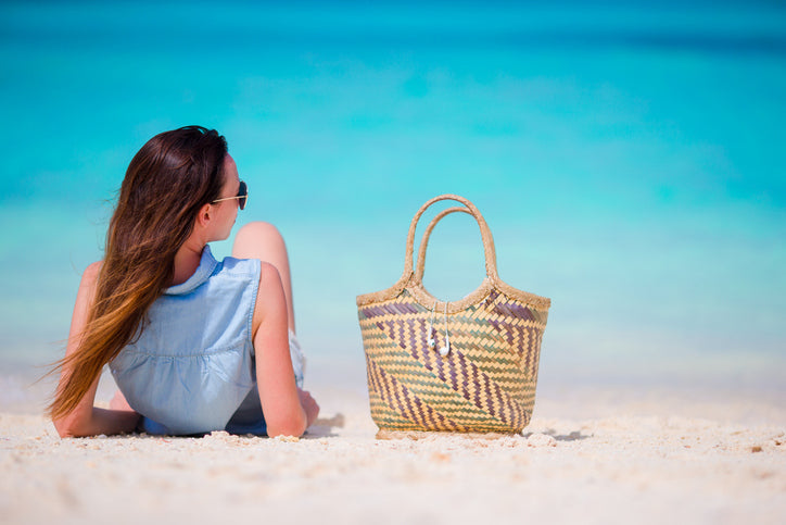


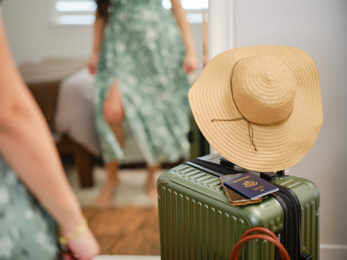


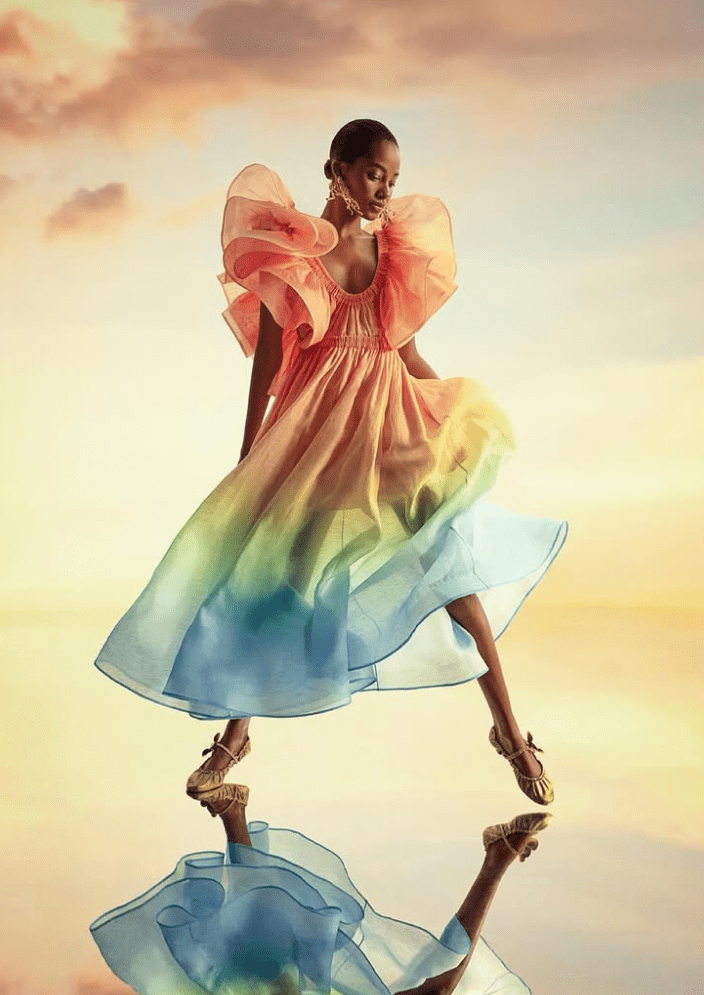
Dopamine Dressing: Celebrate Pride Month with Colours


Celebrate who you are with every shade, every texture, and every joyful outfit.
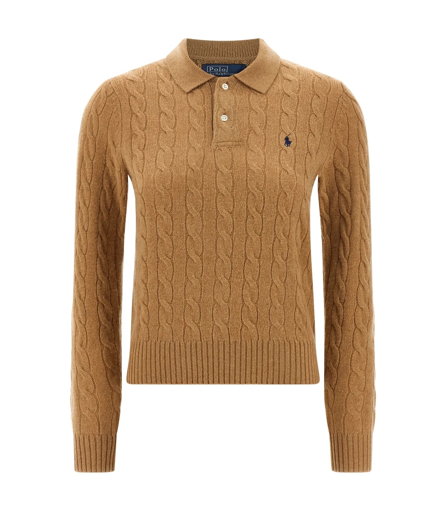
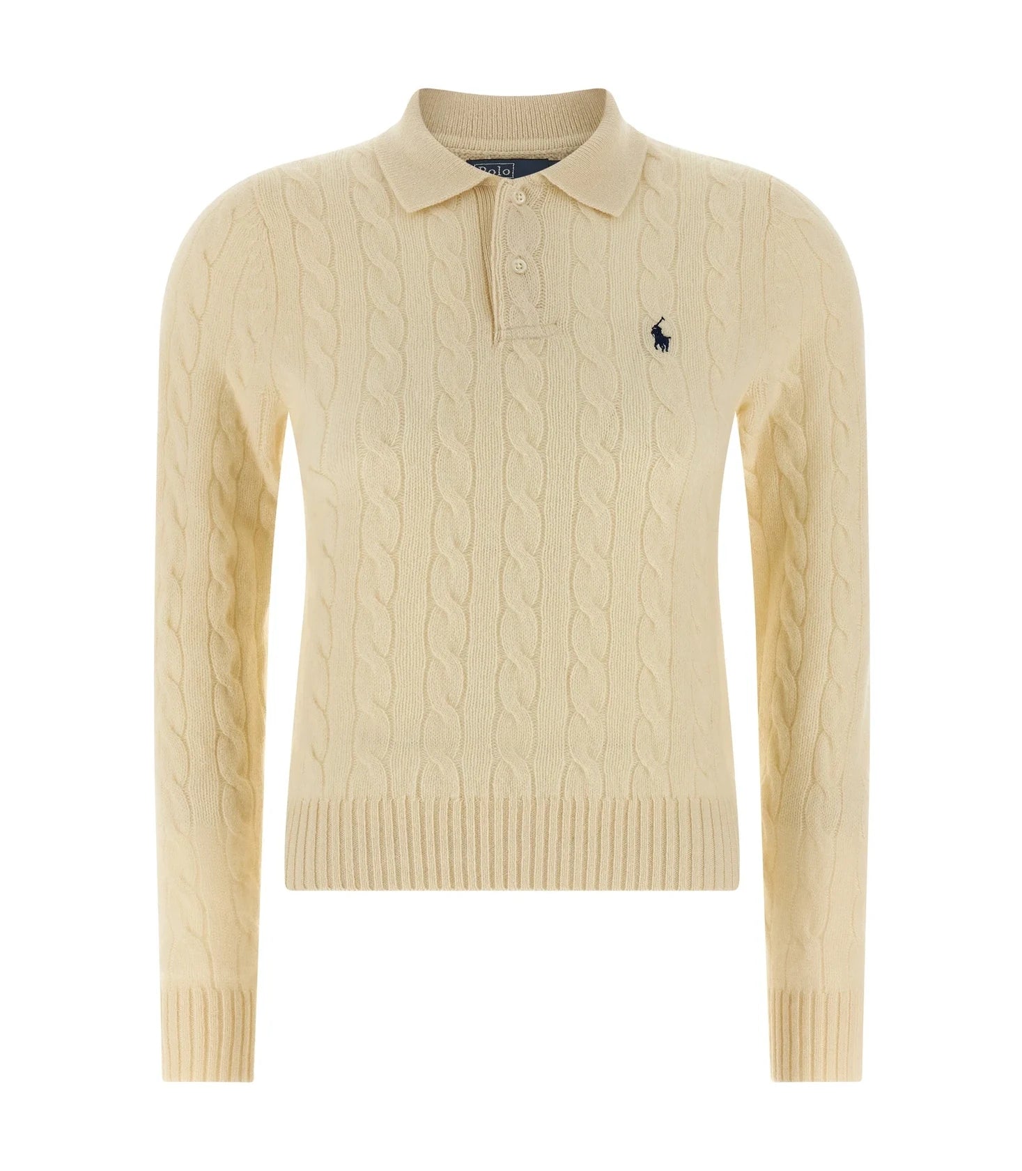
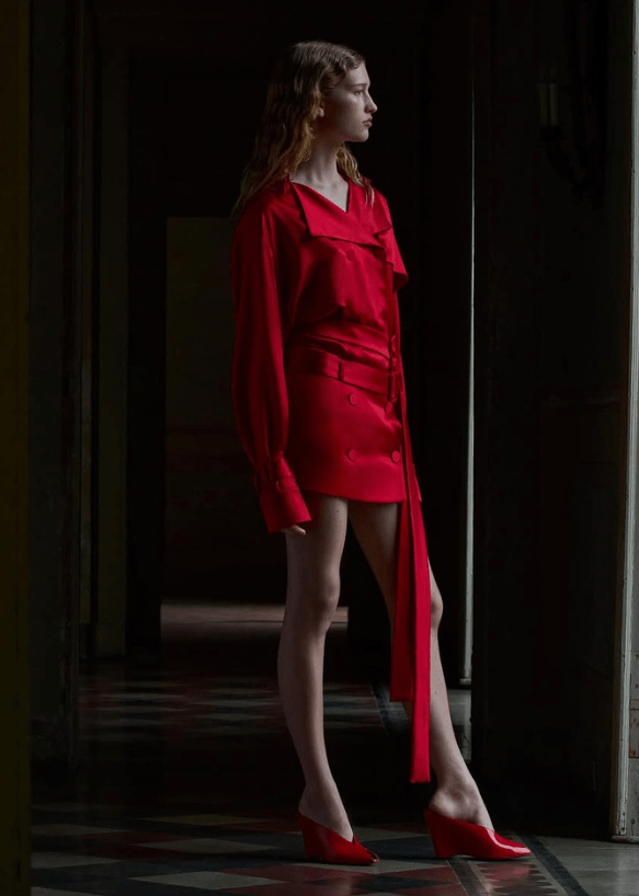
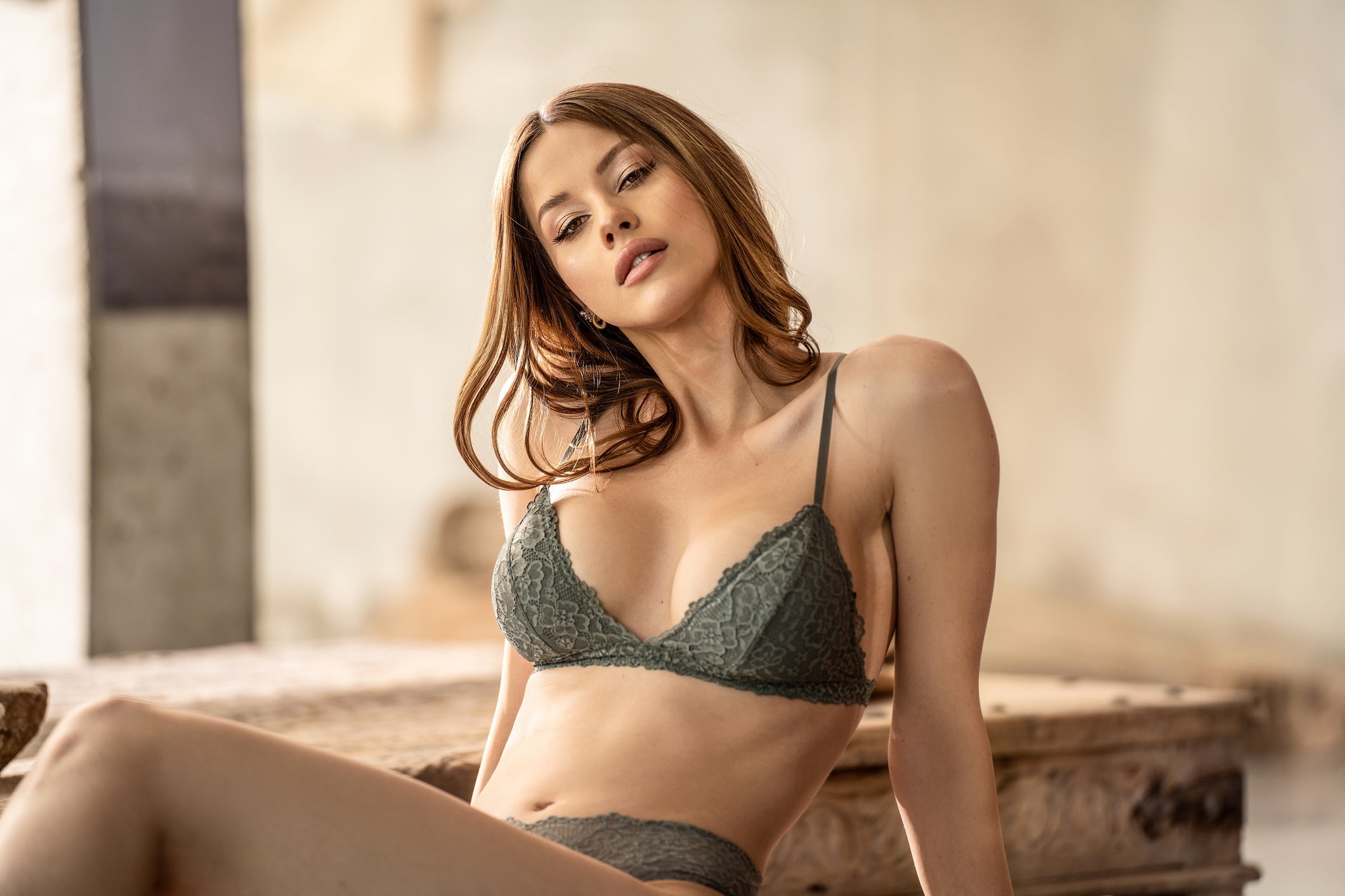
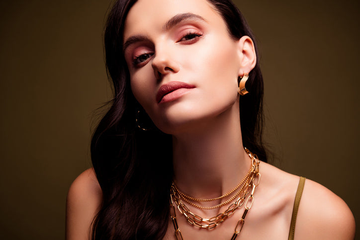
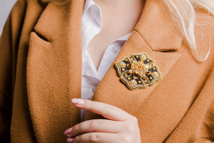
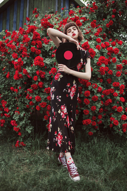
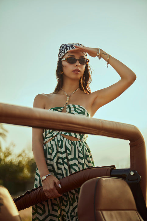
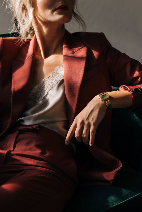
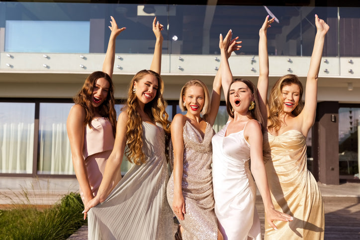
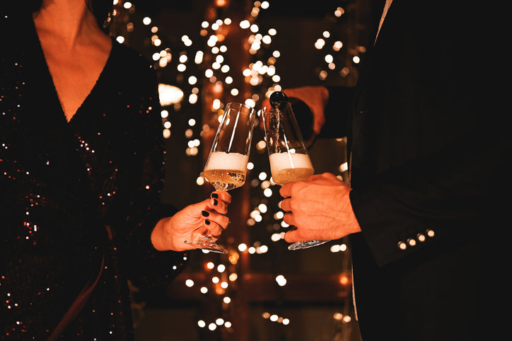
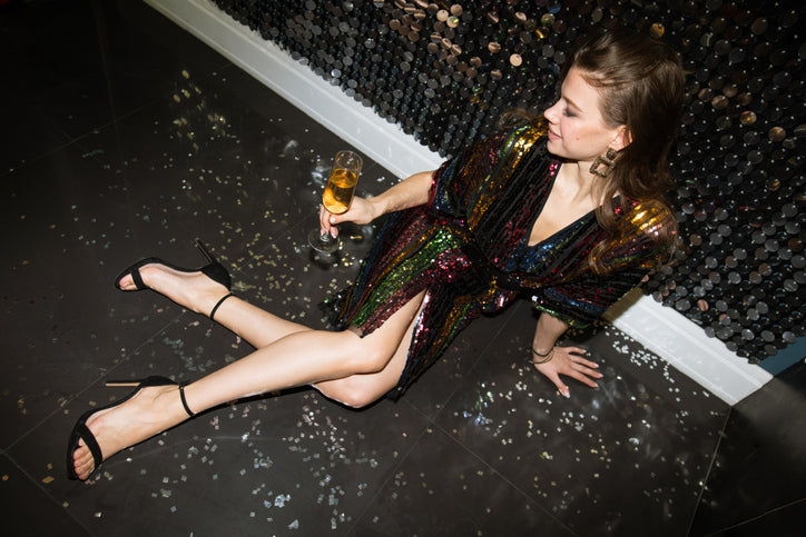
Fashion has always been a powerful form of self-expression, and during Pride Month, every colour becomes a joyful statement of identity. The Pride flag is more than a rainbow—it’s a vibrant spectrum of meaning, and when filtered through the lens of dopamine dressing, each hue becomes a tool to elevate mood, celebrate individuality, and spark joy through style. Red, representing life, bursts onto the scene with energy—perfect for bold silhouettes and power pieces that command attention. Orange, the colour of healing, offers warmth and comfort, wrapping you in tones that uplift and soothe. Yellow, symbolising sunlight, is the essence of dopamine dressing—radiant, playful, and confidence-boosting in the form of standout accessories or cheerful prints.
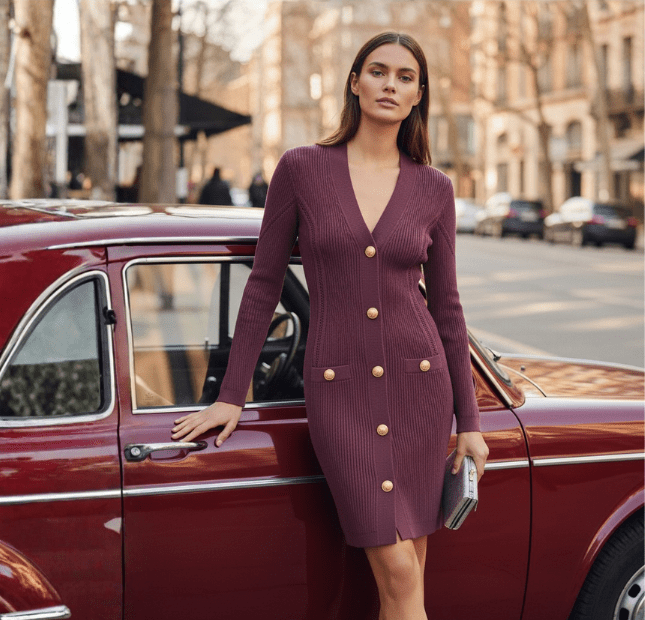
Green reconnects us with nature, reminding us that wellness and fashion go hand in hand—perfect for flowing fabrics and sustainable style choices. Blue brings serenity to your wardrobe, offering calm with a twist of sophistication—ideal for effortless, polished looks that still feel expressive. And then there’s purple: the spirit of creativity and power, adding that fearless flash of colour that completes your look—and your story. This Pride Month, let dopamine dressing guide your style journey.


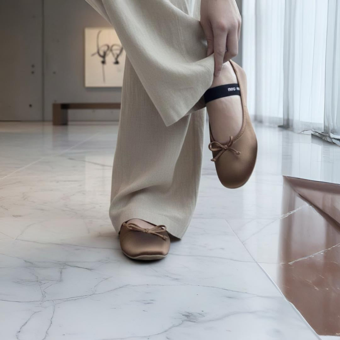
FEMININE STYLE
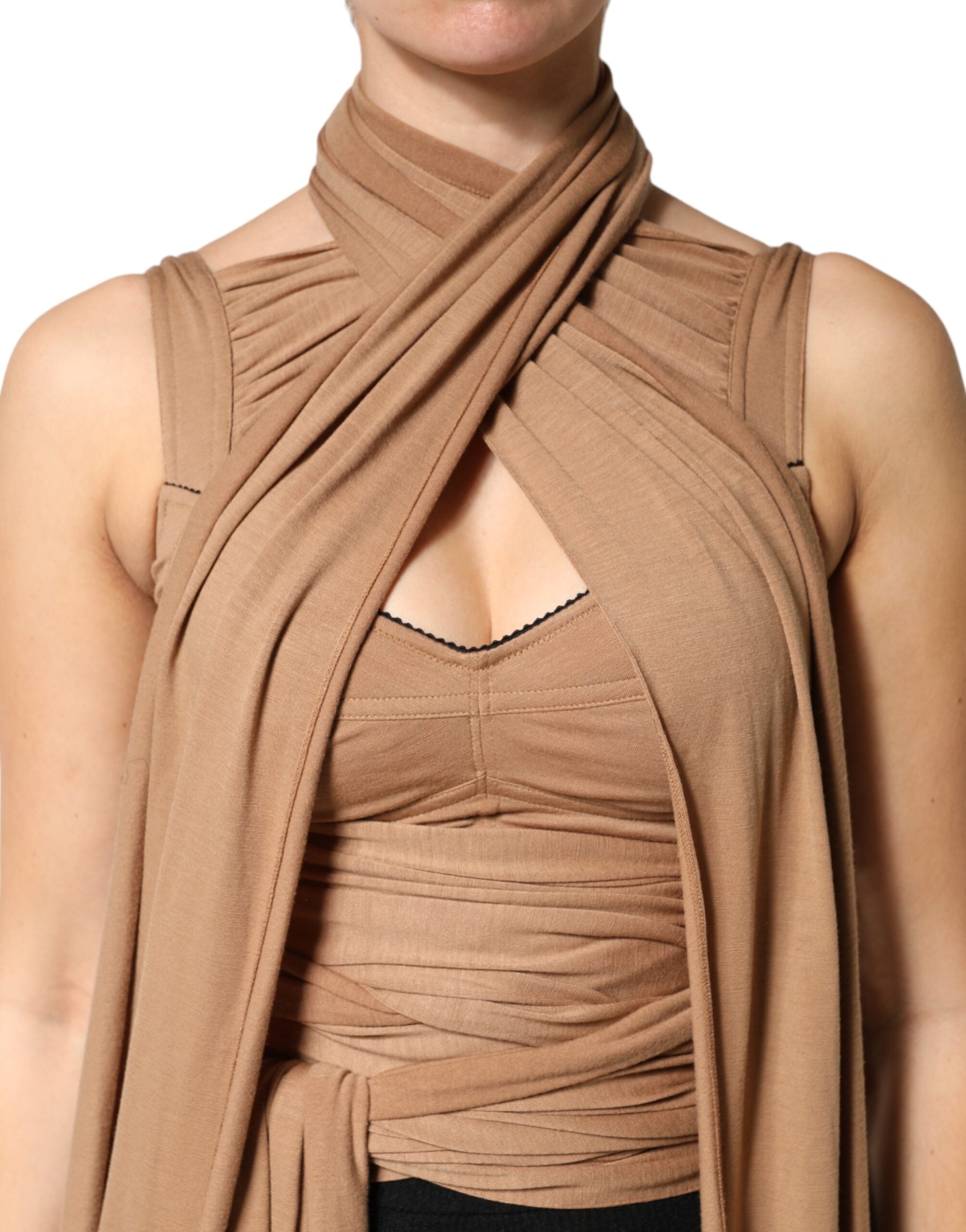
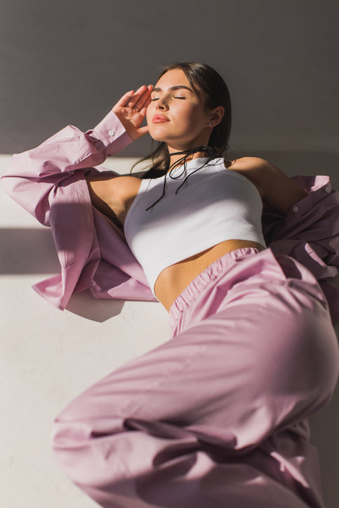
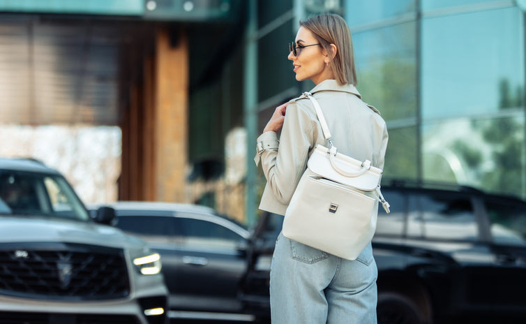
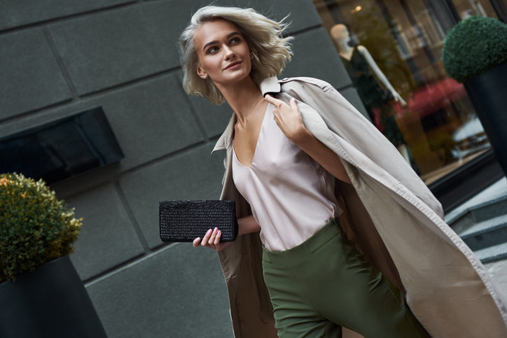
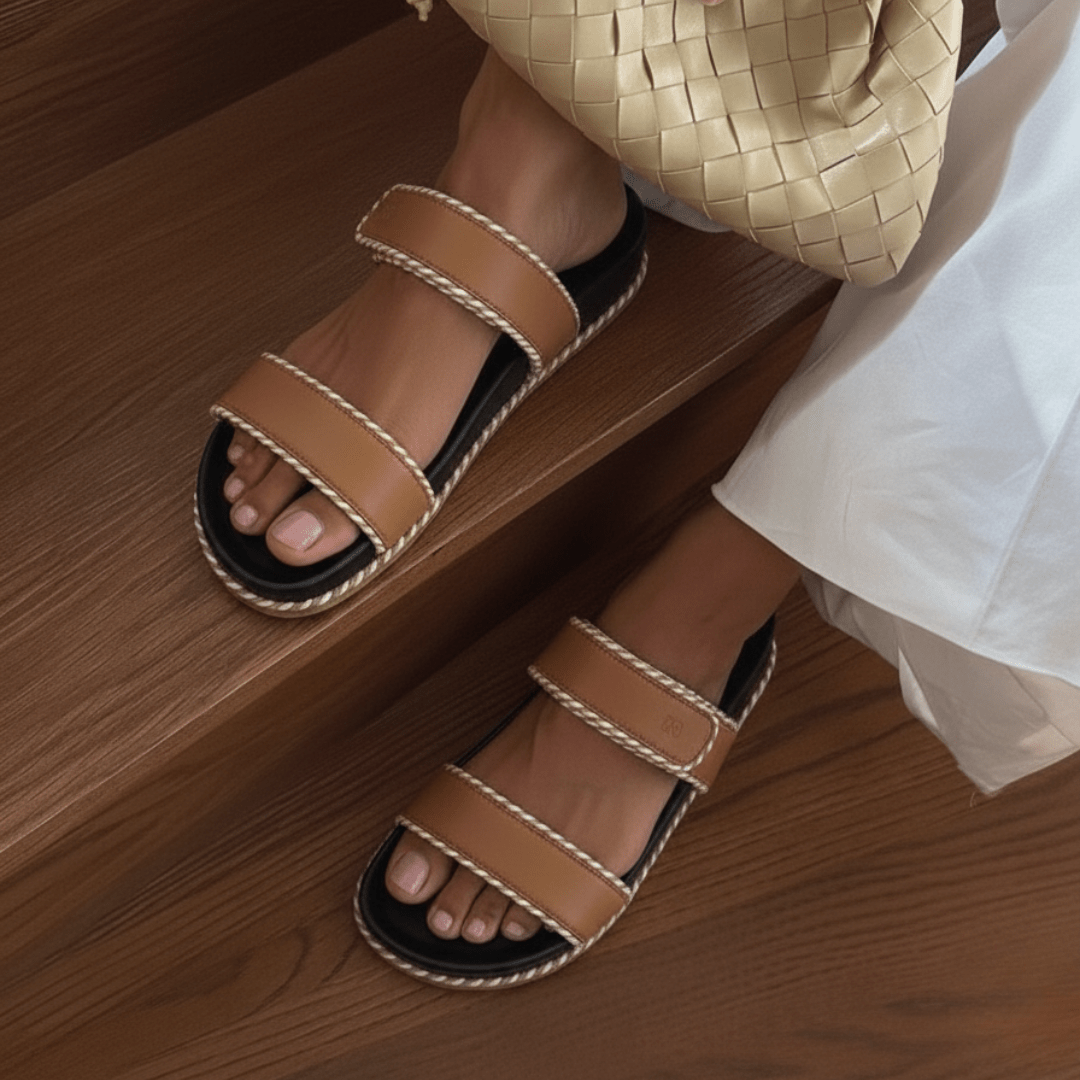
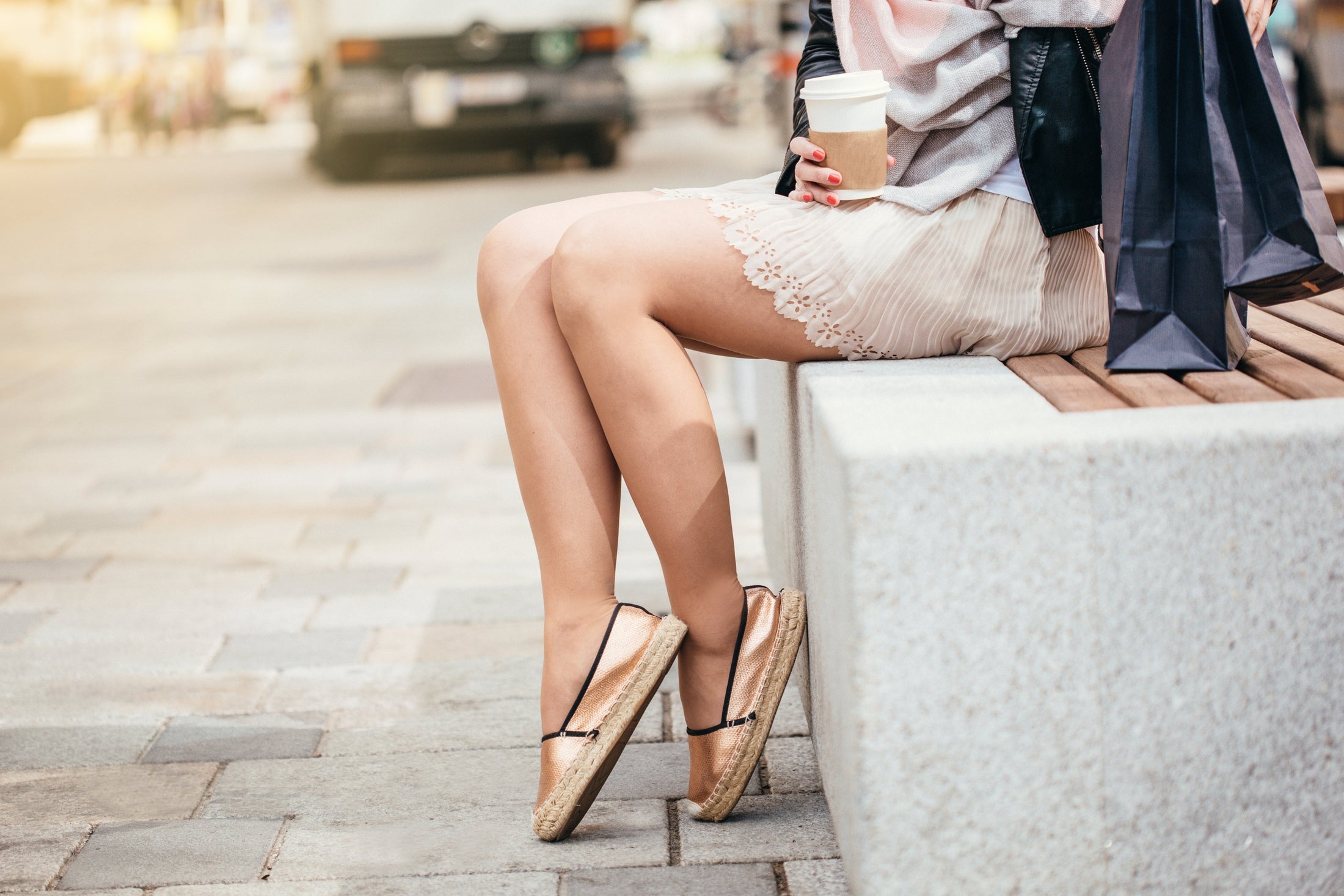
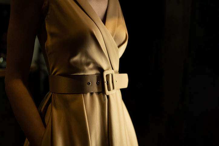
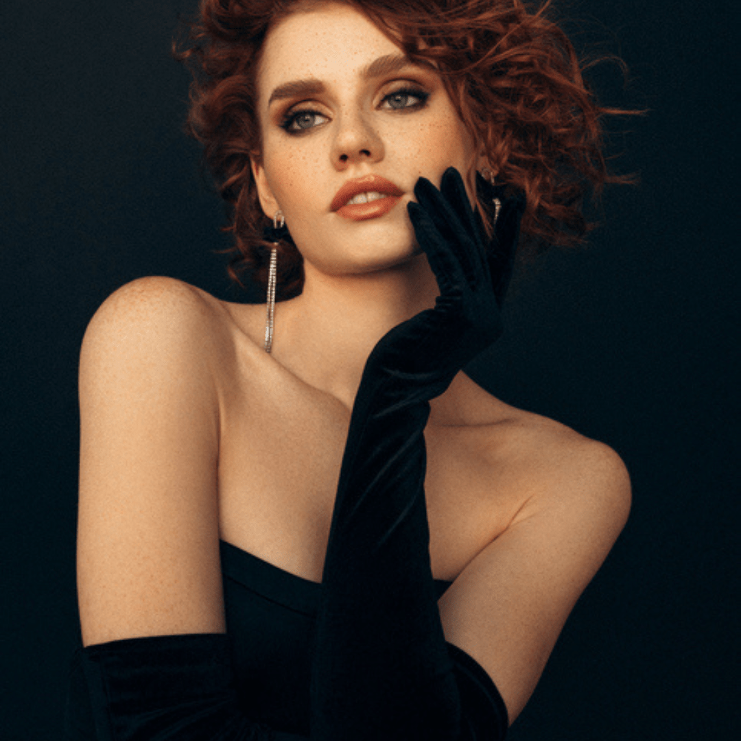
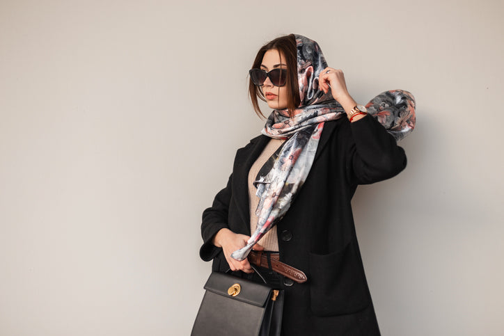
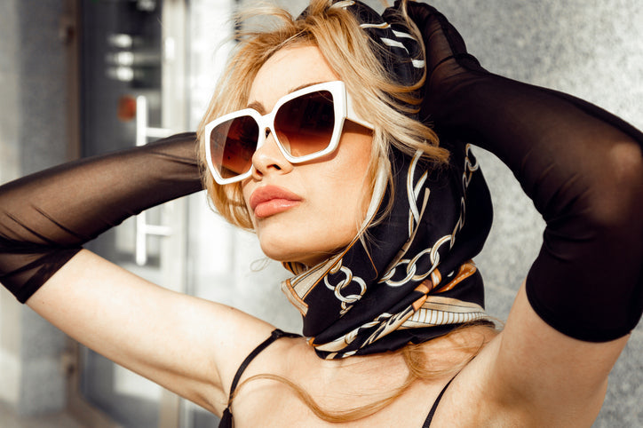
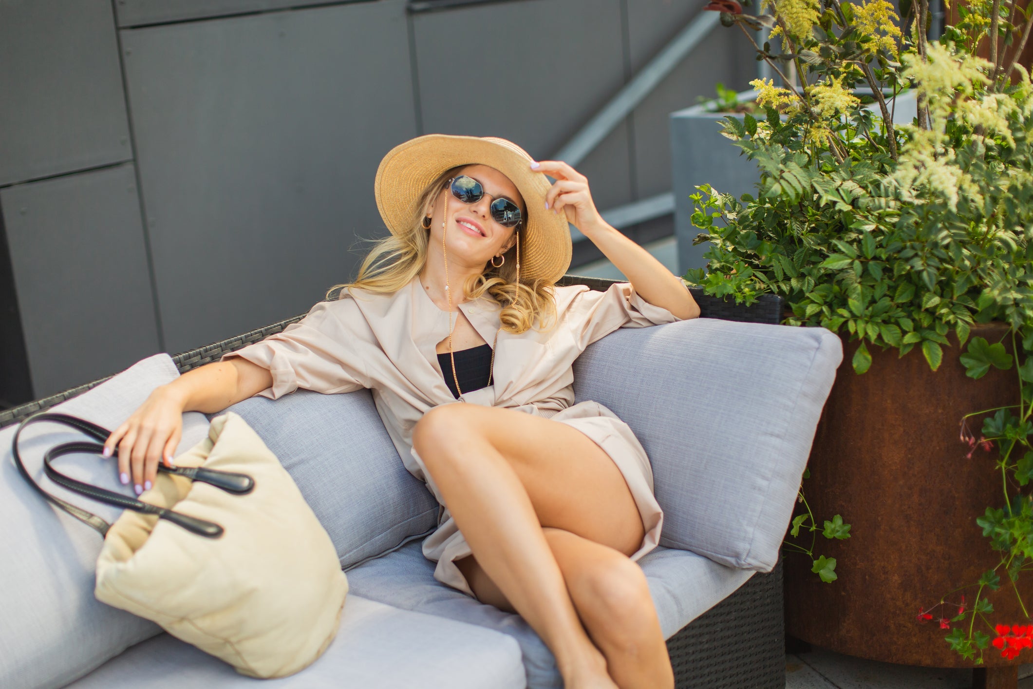
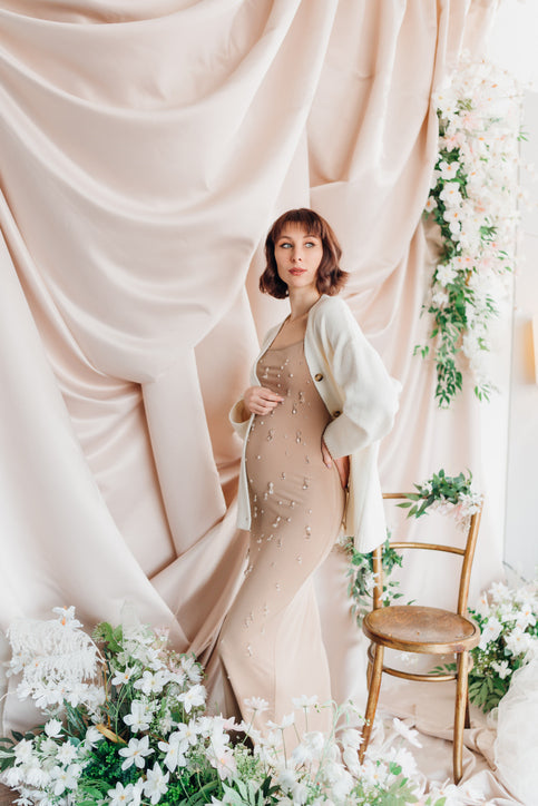
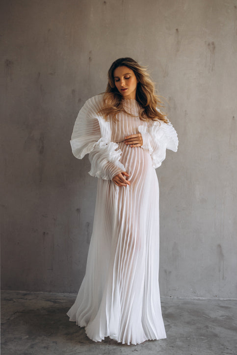
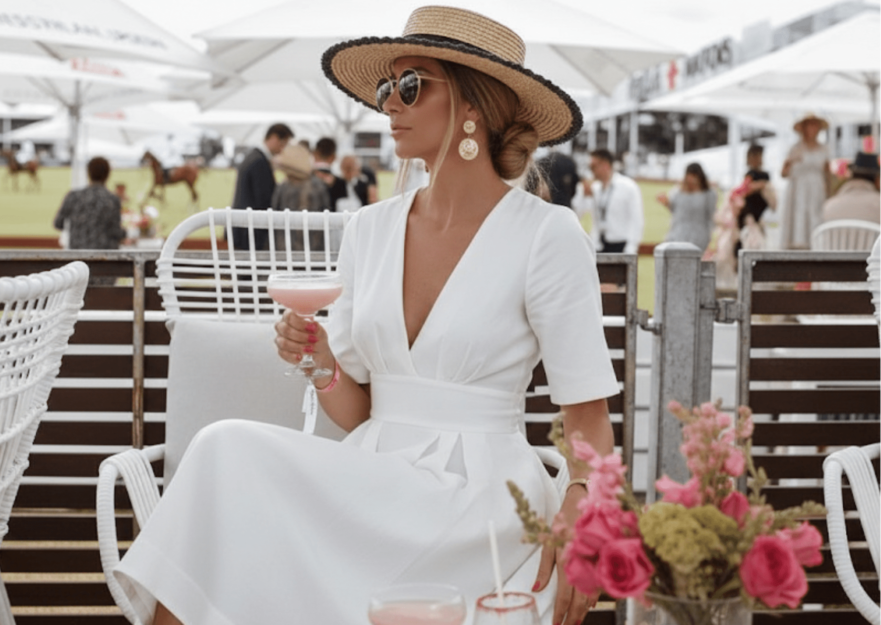
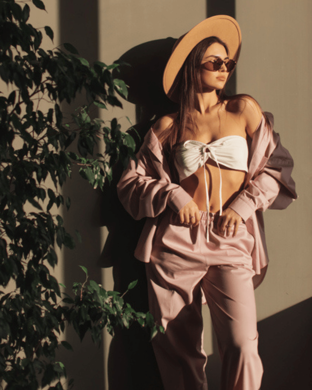
Pastels & Drapes: Here's How to Wear Soft Girl Outfits
GENUINE PRODUCT GUARANTEE
All our products are 100% authentic products sourced directly from brands or from authorized dealers only.
PREMIUM PRODUCTS
We deal exclusively in premium women's lifestyle products, offering a selection of high-quality items.
100% SECURE SHOPPING
Enjoy a worry-free experience knowing that we provide 100% secure shopping.
EXCLUSIVE LIMITED TIME OFFERS
Our team works tirelessly to bring you these exceptional offers, ensuring that you can access the latest trends and timeless classics at unbeatable prices
 GLAM STEALS | ALL RIGHTS RESERVED
- . PRIVACY POLICY
- . TERM OF USE
- . SITEMAP